
If your organization is going to be a part of an event like a seminar or an exhibition, a standee banner can be the ideal method of putting your brand out in front of all the participants. It’s an amazing opportunity to make your audiences familiar with your brand without spending too much. But all the success will come to you if you design your portable sign well and avoid these most common banner designing pitfalls.
Too Many Colours
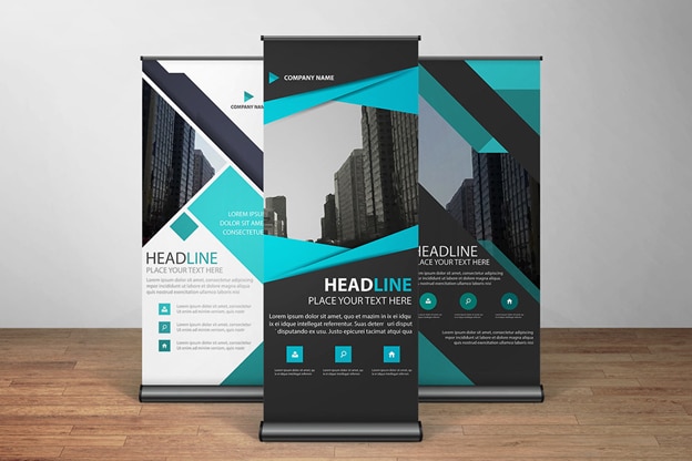
Too many colours on your portable sign will only make it look shabby. Even if you design your standee perfectly, too many colours will only make it look casual and people may not even read through it although they’ll glance over it because of eye-catching colours. The best way to keep your standee subtle is by using the colours that represent your business. Use colours that go in contrast with your brand’s logo and are amazing backdrop colours for the banner.
No Logo
When people see your brand’s logo, they can connect with your company immediately. This happens only when you have created a good identity in the minds of your target audience. But if you haven’t, you should display your logo as much as possible to create awareness. If you don’t put up your logo on the standee banner, you’ll lose several opportunities of making an impact on the minds of your audience. So make sure that you put the logo on top of the banner or at a place where it will be clearly visible.
Tiny Text
Not everybody who’ll be a part of the event will visit your stall or wherever you will be. Your standee banner will do the talking for you, even from a considerable distance. But to make sure that your portable sign talks your brand out, you need to put readable text. Too small font size won’t be visible from a distance, and like this, you will lose out on a potential client. Put the right size of text on the banner so that people can read it from far and come to you to know more about your brand.
The same logic applies to the font style you pick. Choose something readable and formal and nothing something funky or decorative.
No Contact Details
What if people can’t come up to you and know more about your organization? What if they wish to get acquainted with your brand but they can’t due to several reasons? That’s when they’ll note your contact details and get in touch later. But what if your standee banner doesn’t have the information they need to talk to you after reading everything else on the banner? You’ll lose a potential customer. Therefore, put your contact number, email id, website link, social media handles, and other contact details on the banner.
You can also hire the right OOH advertising company to ensure that you don’t end up making these mistakes and design the best portable sign for your event. We specialize in designing and printing all kinds of outdoor signs.


