

No matter where you go, Sydney, New York, Mumbai or Edmonton, there’s no shortage of businesses that attempt to advertise their products and services through a good old signage. This method of advertising has thus far been constant as far as local marketing goes, and it’s not hard to see why that is. Again, just because a business is advertising through signage it doesn’t mean it’s going to be effective at drawing attention, let alone drawing crowds. That is simply because ‘bad signage’ is a real problem and there’s nobody telling you that. Here, as your friendly sign rental company in Edmonton, we intend to elaborate on what constitutes effective signage.
1. Keep it Legible (and Visible!)
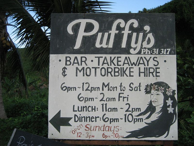
With increased legibility, you can be sure that your signage also achieves increased visibility, and that’s always a good thing. Don’t use funky fonts, stick to simple fonts that encourages readability. Don’t forget about ‘visibility’, you want to ideally pick a signage size that is proportional to the size of fonts you’re using, while also considering the distance from where you expect your signage to be seen. And, pick a spot where there are no external obstacles that get in the way.
2. Keep the Clutter Out
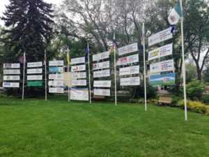
Keeping the clutter out is a universal rule that doesn’t only apply to your signage; it also applies to a website, a wall in your living room, and perhaps your workspace too! When you keep the clutter out, you ensure that your message is getting across as concisely as possible. Too much clutter affects the legibility and the aesthetics of your signage and makes it an undesirable signage that defeats the entire purpose of effective marketing. Remember, ‘less is always more’, and that’s precisely why you must understand the value of empty spaces.
3. Keep it Aesthetically Pleasing
And, when you have finally ensured that your signage covers all the basics that we’ve listed above, it’s time to make aesthetic enhancements along the way. Sign rental companies in Edmonton and beyond believe adding a border can help readability and aesthetics both at once. You must also be mindful of the fact that images have value and sometimes speak more than words ever could. Work with your sign rental company to create better graphics and artwork for a better visual impact.
4. Keep the Colors in Mind
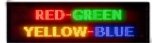
Colors act on a subconscious level more than they act on a conscious level. You won’t go “jee, those colors just don’t work with signage”. That’s just what we sign rental companies do, we confess. But, we do that for good reason. If you’re picking the wrong color combination for your background and your font, that directly affects the primary purpose of your signage: be read with ease. As a rule, it’s always best to remember that the greater the color contrast, the better the readability and the better the aesthetic impact. Your sign rental company in Edmonton can help you pick the most effective color combination.
Now that you have an image of what an effective signage design looks like, it’s time you look for an entity that can help you execute these effective designs. This is where we come in. We have the experience with the creation of effective signage designs and we extend our products and services for your benefit. Get started and save the world from bad signage!