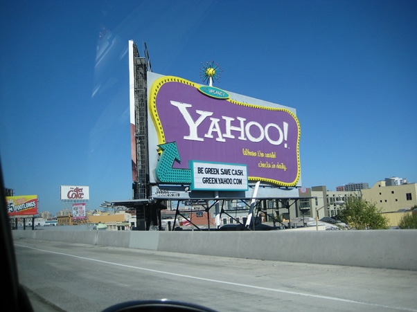
Planning to invest in outdoor banners is one of the best business decisions for putting your brand in front of a new set of audience. Banners, when designed and placed correctly, can target a large mass and be highly advantageous for your business. But while designing your banner, the textual content needs to be perfect so that you can gain the results you expect. And for that, here are the three types of content you should never put on these outdoor signs.
Slang or Informal Content
Using slang words on your outdoor signs is a big NO-NO! If you run a business, your target audience would appreciate it if you use words that go in line with your business. Using slang words will only make your brand look too casual. At times, people may not even understand the context in which you use the slang. They may end up misunderstanding the content or not understand it at all. This is a big mistake as you won’t be able to communicate with your target audience the way you wanted to. Therefore, avoid the use of slang words. Use them only if required, depending on the message you are trying to put forth.
Too Much Content
Another mistake a lot of business owners make is putting up too much content on their outdoor signs. Your banner only has limited space on it. If you overcrowd the space with a lot of written content, there will hardly be any space to put up your brand’s logo and contact details. You need to create a perfect balance between the content, empty spaces, and other information such as the graphical content and your logo. Keep the design in mind while creating content for your banner. Let the content be as short, crisp, and precise as possible.
And remember, people will have a very less time to glance at your banner. So make sure that you don’t put a lot of information that your target audience won’t be able to read and understand.
Technical Content
Just like misunderstanding the slang words, your audience may not be able to understand the technical jargon you use. Some technical jargon about your business is easy for you to understand. But that isn’t the case with your target audience. With limited time available to look at your banner and inability to understand the content used, your audience will fail to grasp anything. This will be a serious waste of energy and resources as you won’t be able to tap people the way you wanted. Hence, use simple words and easy-to-understand language on your outdoor signs.
Once you know what kind of content should not go up on the banners, you are ready to design your banner well. The only thing required now is a reputed outdoor marketing company to convert your ideas into tangible results.


