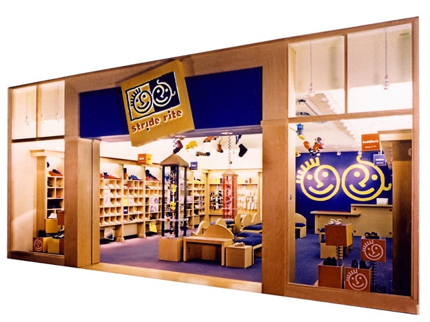
You must have read and heard a lot about how you should design window graphics for your medical store? But did anyone tell you the don’ts of the same? In this article, we will tell you the kind of window graphics you must not put up for best results.
1) Too Colourful
Window graphics with too many vibrant colours aren’t meant for all kinds of businesses. These types of window graphics work well for clothing stores, sports goods stores, and toy shops. But when it comes to medical stores, you must opt for subtle colours and patterns. Even if you are trying to depict a scene with humans, use lighter shades of colours so that your window graphics don’t look too loud or flashy.
2) Too Technical
When it comes to medical stores and other medicine-related things, people tend to use medical terms. Some medical words and names may seem familiar to people working in a clinic or a medical store. But when it comes to common people, they may not understand what you are trying to say through the graphics. Your customers, who are normal homemakers and office-goers, may fail to understand what you communicate. They may either ask you questions about the language used or simply ignore your window graphics. And if you or your staff isn’t available or fails to explain the right thing, your investment in graphics may go waste. Therefore, always use simple and easy-to-understand language that even a layman can understand.
3) Too Exposing
Sometimes, it is necessary for medical stores to put pictures of the human body and anatomy to explain how things work. However, too much of such illustrations and pictures may not look good and may make your clients uncomfortable. For instance, a picture of human genitalia to explain how certain medicines work may not be a good idea as it may affect your clients. Therefore, use window graphics with simple and “clean” pictures and graphics.
4) Too Crowded
The success of your window graphics depends on the location where you put them. Too much content will be nothing but a waste as people won’t have a lot of time to stand and read whatever you have on the window graphics. No matter where you put up the graphics in your store, nobody will read it entirely. You must have short, precise, and informational content instead, something that people can just glance through or read till you give them what they came to buy.
If all these guidelines look like too much for you to keep in mind while designing your window graphics, then get in touch with us. We specialize in designing the best window graphics as per your needs without overdoing anything so that you can expect the best returns on your investment.


