
The first impression is the last impression; it is known. People can become loyal customers or turn away never to return depending upon the information your storefront sign provides. The signage represents your brand, so better have an on-point banner that matches your brand quality.
Here are some designing mistakes which you can avoid like you avoid your colleagues after work.
1) Too Much Information
You might have quite a few words to boast about your brand. However, signs are the most efficient when they are simple and to the point. The storefront sign should convey about your brand in as few words as possible, and it should not be such that it tells an entire story. The sign should be designed in such a way that the target audience gets interested in the brand in a short period and not get disinterested in reading long paragraph texts.
2) Poor Contrast
The colour choice for the background and foreground plays a very important part. Colours should be selected in such a way that the store sign is easy to read and understand by the target audience. A dark background with a dark foreground and vice versa should be completely avoided. High contrasting colours which make the sign easier to understand must be adopted.
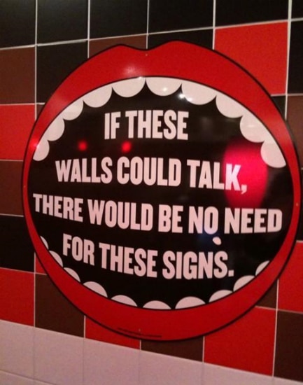
3) Wrong Graphics and Text Choice
The choice of the logo and the text used should be aesthetically pleasing. Try avoiding super-stylish font which may create confusion while reading. Your logo and the tagline represents your brand. The logo should be designed in such a way that it becomes the identity of your brand and not some meme material for the internet. Typing errors should be avoided as they can turn into something unintentionally funny, which might get the wrong kind of attention from customers. The font size should also be considered while selecting the font for the sign.
4) Poor Brand Representation
The designs and text on the new signage should be consistent with the brand image. The signage should ideally have the same look as business cards or other marketing materials. There should be consistency with colours, fonts, and graphics. This helps create brand recognition. Potential customers will see your sign and instantly know it’s you.
You also need to ensure that the sign is visible, easy to read, and in good condition. A sign in bad condition will make potential customers think that you do not care about your business, or you aren’t doing well enough to fix or replace the sign.
If you are still not sure about which storefront sign might suit the best to you, we are here to help you out.


