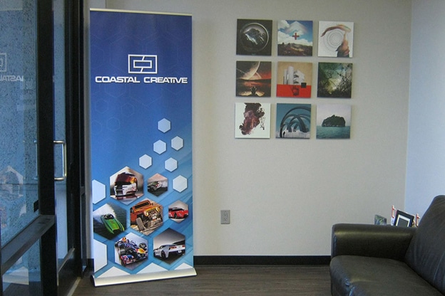
Standees, roll-up banners, or retractable banners – whatever you name them, they are going to be one of the best ways to advertise your upcoming event or market a brand during an event. Thanks to the portability and ease-of-use, these portable signs make their way to every event. Whether it’s about outlining the key of that event or marketing a sponsor or a brand, these banners prove highly advantageous. But all these benefits are possible and practical only if the standee designing is done right. So let us look at some tips for the best standee designing.
1) Logo at the Top
The first place where your viewers will look on the standee is the top space as this area is at the eye level of people. Therefore, use this area to communicate directly with your viewers and to tell them who you are. Use the top of your stand to display your company logo so that people can understand who the standee is about. If you want, you can also place other valuable information in this space such as your brand’s tagline or something like “welcome to the event.”
2) Limited Colours
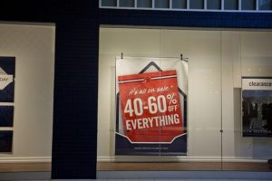
Colours play a vital role in making or breaking the impression you are trying to make through the standee. Colours can help to make you stand out at an exhibition, but they must tie in and work well with your existing corporate colours and of course your logo. Bright colours like red and orange can grab the attention but be sure to avoid using yellow and white together as it will be hard to make out any information, especially from a distance. Be as minimalist as possible and use limited colours for standee designing.
3) Go Left to Right
Consumers are used to reading from top to bottom and left to right, so remember this when filling your banner with information. It is also important to only include relevant information and keep words to a minimum. Be smart and think what should go up on the standee. Based on what you are trying to achieve by placing the standee in your event, you must use the relevant content.
4) Use Images
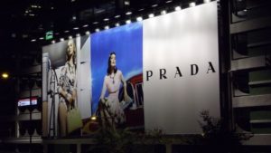
It’s right when they say, “pictures speak louder than words.” Use more pictures on the standee to communicate well. If you are going to include any images on your roll up stand, particularly product images, then be sure that they are high quality. But don’t crowd the banner with a lot of images. Keep the right balance between images, content, graphics, and spacing so that people can read and grasp the standee content even in less time available.
You can also talk to our experienced standee makers for more of such excellent and successful standee designing tips.


