
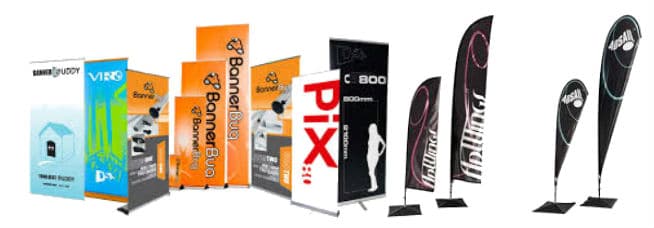
Banners can be used to communicate a brand’s important message to passersby or to investors at a trade show. They are used as a tool for directing the passersby in your store and also to advertise new products that you have to offer.
There are some common mistakes which marketers make when using banners stands. These mistakes can negatively affect your promotion and prevent you from achieving your sales goals. Here’s a look at some common banner design mistakes to avoid.
Not Properly Designing the Banner
Your banner should be designed in such a way that the colors should complement each other. Make sure the font is legible, and you use a background color that compliments the font. Use the entire area on your banner to communicate the information in a proper manner. However, be careful that you do not make your banner look cluttered with too much of information. This may confuse a reader and hence, he may not go through the entire message on your banner. Lastly, use colors that stand out from the surrounding environment where you place your banner stand.
Not Having a Proper Stand
Position the banner in such a way that customers notice the banner and can relate to where your shop is or what product your shop is advertising. Additionally, your banner stand should be positioned on a smooth surface so that they stand still even if it gets pushed by some passersby or when there is a strong breeze. Therefore, check whether your banner stand is in proper shape before you start advertising on it.
Delivering a Poorly Written Brief
This happens when the designer does not understand the needs of the client completely and the design ends up being haphazard. It is important to convey each piece of information to the designer and what are the expectations from them. If possible, give the designer a thorough explanation about every aspect of the project. Moreover, avoid using jargons which makes it difficult to people to understand.
Over-Designing
You need to make sure that you do not over design your banner by adding too many pictures, colors or text. Too many elements on the banner leads to the banner looking cluttered. Your reader will fail to understand the message.
Incomplete Information
Ensure that you have conveyed the right information and that there is a way for the customer to contact you. Provide your contact details. Also, take a look at your previous banner ads and notice what you missed or what you could have done better.
These are some the banner design mistakes to avoid. In case you need help in making better banners, it is recommended that you consult a professional firm who will help you advertise better.


