
Billboards is a simple channel to reach a large audience. They are usually spotted on busy streets and highways. But, conveying your message through a billboard can be tricky, as the audience is usually driving or walking by with hardly a few seconds to look at and grasp the message on your billboard. Therefore, your billboard design needs to be attractive as well as easily readable to allow maximum returns. There are several commonly made billboard advertising mistakes that have a negative impact on the billboard campaign. Because of the huge investment that billboards demand, these mistakes can lead to expensive losses.
There are number of billboard advertising mistakes made that can tarnish your marketing efforts. Here are the top billboard advertising mistakes you don’t want to make.
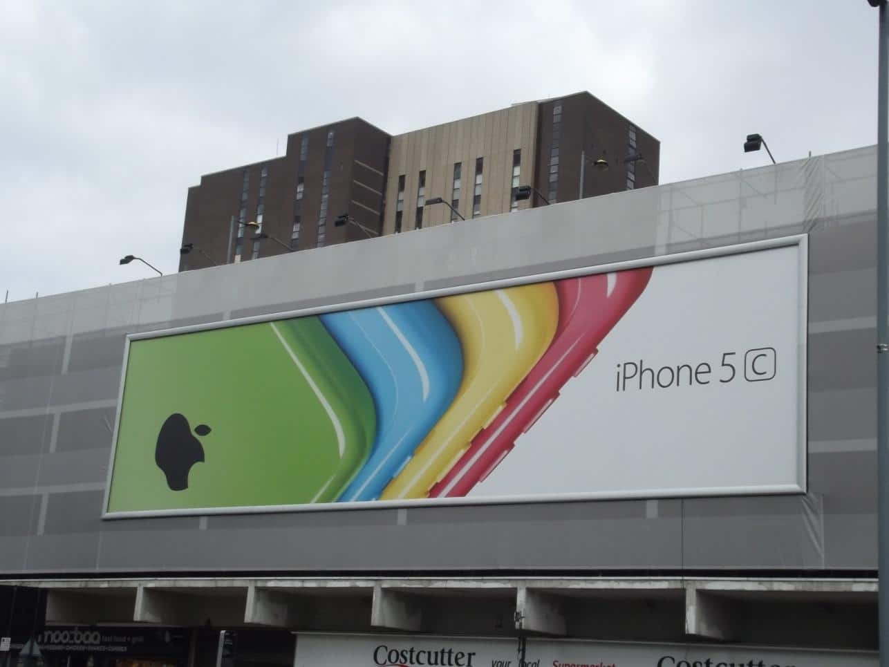
Ineffective use of the Color Palette
A billboard must be attractive to arrest the attention of the mobile audience. When it comes to choosing from the color palette, many make the mistake of blending heavy colored text with a dark background. This might work in print media, but is not a good choice for billboards as it can be a difficult read. Also, limit the use of light shades like yellow or white, or even a combination of light shades altogether. These tend to fade out in the bright sunlight or glowing spotlights. Using bold and bright colors with the right contrast is the key to an effective billboard.
Stylized Fonts
Thin, stylized fonts may look fancy and attractive, but they are a bad choice when it comes to billboards. Thin and fancy fonts are difficult to read at high or medium speeds. Keep your billboard simple by using clean fonts such as Calibri, Tahoma or Helvetica. Also, avoid all capital letters in your text and keep enough distance between each letter. Using a large font size that is easily legible from a far distance is equally important. When designing a billboard, minimum font size should be 18’’ inches tall with 3’ feet and taller being optimal.
Large Chunks of Text
While it is essential to avoid large, visible unused spaces, many make the mistake of filling the space with large chunks of text. Remember that your audience is constantly on the move. So grasping such long messages is difficult and it can distract and irritate the audience. Keep your text limited to seven words or use a catchy short phrase. Convey your message in short, sweet and safe way.
Placement
An effective billboard can capture attention if placed right. Not selecting the right location can fail the whole billboard idea. Considering your target audience, the number of people who actually see the ad, and the traffic are essential while placing your billboard. Placing a billboard in a nearby location that shows the way to your door is also a great option.
Many companies try to design the billboard advertisement themselves that results in these frequented advertising mistakes being made. An effective billboard needs to be kept simple yet attractive. It is best to consult a professional advertising agency, which can assist you in creating an eye-catching billboard.


