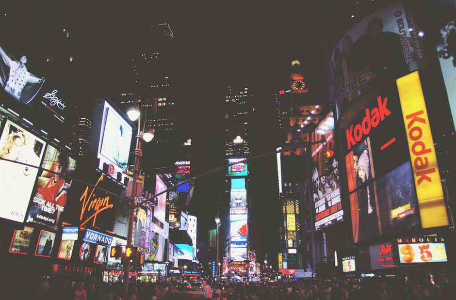
Image Source: pexels.com
In spite of the advent of the digital era, billboards remain an effective medium of traditional advertising. It is one of the oldest forms of outdoor advertising that is inexpensive and provides certainty of being spotted. While driving on a highway, you may come across innumerable ad billboards but there are few which capture your attention. With online advertising becoming a choice of medium, traditional advertising ways like ad billboards need to be designed creatively to create an impact on the audience. If you are investing money on it, then you want to be sure of its success. Here are some billboard design tips for effective billboard advertising.
-
Create a story
A story is an effective way to communicate the message to the audience. People are great at remembering messages enveloped within stories. Whether you want them to remember the brand name or check out that new eatery opened in a nearby locale, find a story and design the billboard that communicates it to the viewer in a span of seconds.
-
Less is more
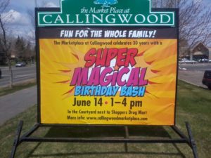
The driver or motorist on the highway will hardly have a few seconds to ponder over the ad billboard. They will show no interest on billboards with large chunks of text on it. The rule is to keep your text limited to seven words. Let the message be conveyed in a short, sweet and safe way!!

Image Source: Helney, Flickr
-
Charm with Visuals
A picture is worth a thousand words. This is absolutely true in the case of billboard ads. Keeping in mind the message to be conveyed design a relevant image that will arrest the attention of the viewers. Use bright contrasts in your design to make it colorful and eye catchy. You can also go with 3D visuals to create deep impact.
-
Readability
The text on the billboard should be readable from far away. Choose simple and large fonts in an appropriate color.
-
Simple yet Smart
You need to be smart when designing your billboard ad. An extremely ordinary approach will make it boring. On the other hand, if you overdo it, the public may not understand your billboard, eventually failing to create an impact. Hence, it is best to keep it simple yet attractive with just the right images and a short message which will create a lasting impression in the minds of the viewers.
-
Placement
The placement of your billboard goes a long way in determining its impact on the audience. Highways and busy streets are a preferred location as it helps to communicate the message to a large audience. You must keep in mind the target audience and environment while positioning your billboard. It would be of no use to have an architecture event advertisement near a school. At the same time, you do not want your billboard to be in a place which is cluttered with innumerable billboards. That will make it loose attention.
-
The More, the better
Having just one billboard will not suffice. Have multiple boards which are strategically placed keeping your target audience in mind. Multiple billboards help increase your brand’s recall value.
These are some tips to create an effective billboard design. Let your billboard be striking but not distracting. To produce an exceptional design that provides desired results is often not an easy task. Take help of advertising companies to develop an effective plan which helps to register the brand image in the minds of your audience.


Pingback: Top Rules For Effective Billboard Advertising |...
Pingback: Can You Afford Billboard Advertising?
Pingback: 4 Reasons Traditional Marketing Still Works