
Image Source: Elliot Brown, Flickr
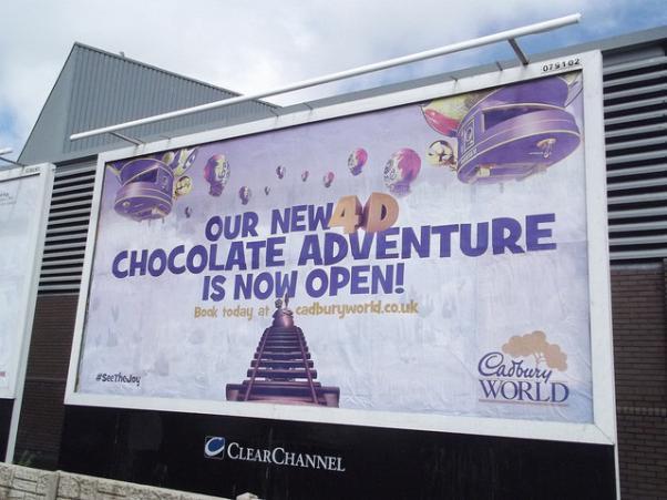
Billboards make an effective traditional advertising tool even today where digital media is on the rise. You can see innumerable billboards while driving past a highway, yet only a few of them are able to capture your attention. A well-designed billboard with the right typography grabs eyeballs. Typography plays a critical role in a billboard design. Even though you may have a captivating message, using the wrong typography will fail to grab attention.
The audience reading a billboard is usually driving past on a busy highway with hardly a few seconds to read and absorb the message on the billboard. Therefore, you need to make sure the design is attractive and the typography is legible for that limited time. Here are a few billboard design tips for billboard typography.
-
Simple Fonts
Keeping in mind the audience, your message must be legible at a distance of more than 1000 feet. Avoid capital letters, and maintain enough distance between each letter. Letters that are too spaced out or too close will not make for an easily understandable message.
How much ever you love using fancy fonts, they are a complete no for billboards. Thin and fancy fonts are difficult to read from long distances at high or medium speeds. Remember your message must be readable for both slow pedestrians as well as speedy riders. Sans Serif fonts like Arial, Calibri, Verdana, Tahoma and Helvetica are perfect for billboards. Simple, modern and easily intelligible, they are the perfect typography choice for effective billboard designs.
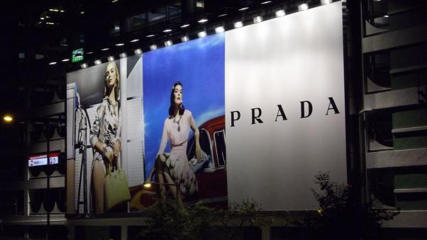
Image Source: pixabay.com
-
Font Size
The key is to use big font size to allow viewers to absorb the message from a far distance. Having unused visual space on your billboard is not recommended. Big fonts are not only legible but provide the advantage of occupying such white spaces. Putting too much text can turn the viewer off. The trick is to use a short, yet compelling message of not more than 7 words. An eye-catching slogan in the perfect typography is sure to arrest attention.
-
Bold and Contrasting Colors
The option of soft pastels is ruled out from the color palette for a billboard design. Bright and bold colors with a high contrast look stunning and arrest attention at all times of the day. Shades of bold colors like green, black, red, yellow or orange can be used to create contrasts. Also keep in mind the image used while choosing billboard colors. Bold and bright colors in contrast will create an appealing billboard.
Being simple is the key. Billboards must be made attractive but not distracting. These billboard design tips can guide you to create an effective billboard design. If done right, a billboard design can achieve the desired results for your brand. Producing a compelling billboard design is often not easy. Knowledge and guidance of advertising professionals can drive you towards successful billboard advertising.


Pingback: Effective Tips To Get Typography Right On Your ...