"All men make mistakes, but only wise men learn from their mistakes" – Winston Churchill.
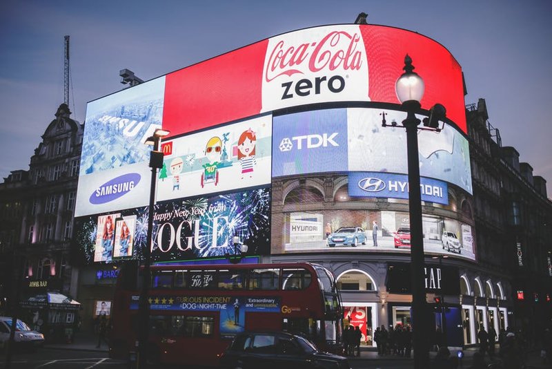
We all tend to make mistakes but like the above quote says – you should learn from them. However, when you are advertising outdoors, a mistake can cost you a lot of customers. Moreover, it will render your outdoor advertising ineffective and you end up wasting both time and money. Here’s a look at some common graphic design mistakes to avoid.
Inappropriate Word Spacing
Word spacing is extremely important for you because it allows readers to read your message easily. It is your duty to ensure that the design has appropriate word spacing. You should also have proper letter spacing which will make the overall message to look evenly distributed throughout the advertisement.
Disregarding Readability for Aesthetic Reasons
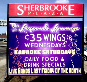
The purpose of your outdoor advertising is to communicate to customers about your products or services. Thus, having the correct font and color has to be a top priority. A common mistake made is having a low contrast between the text and the background. Instead, keep the contrast high. Also, avoid using a fancy font that makes it difficult in the first instance. A person in his car won’t stop to read your advertised message if he is unable to understand what’s written. Similarly, there will be several advertisements around and if your reader does not understand, then he may not be interested in reading your message again.
Remember that your advertisement can be highly appealing but it’s of no use if your target audience is unable to understand. Therefore, use a font style that is easy to read in the first instance itself.
Keeping Your Message Long
Always remember that there may be multiple outdoor advertising. Hence, you need to keep your message short so that your customers can remember what you are conveying and retaining the information becomes easier. The attention span of onlookers is less and so, you should be able to communicate the message in the quickest manner possible or else, they may lose interest. Inform your designing firm that you will prefer a message which is short and will give the customer an overall idea of your brand. Also, your advertisement will be viewed by motorists and thus, you need to keep your messages short. Long messages are hard to read while traveling on the road.
Not Using the Correct Alignment
In case you are having pictures and texts, you should have them aligned such as the readers know which text relates to which picture. For example, a restaurant who wants to advertise multiple dishes with different offers and discounts for each dish will have to correctly align the discount texts with the correct picture of the dish. If there’s no alignment, then the customers will end up ordering the dish which he thought there was a discount on but will end up not getting the discount. As a result, he may be frustrated and you may end up losing out on a customer. Thus, aligning your text with your image is very important.
Not Designing for Specific Audience
An advertiser should know what audience he is catering to and should design accordingly. For example, a wrist watch meant for teenagers can be advertised in a creative way where the functions of the watch such as a funky dial, touch screen which has a step counter and lap timer, etc. are shown on the advertising board. If your audience is working professionals, then you cannot focus on funky dials or casual language on your advertisement.
These are a few graphic design mistakes to avoid. Your brand image is extremely important to you and hence, you need to be very careful while advertising outdoors. However, when outdoor advertising is done right, it can help you attract customers and improve the sales for your business. So, if you are considering outdoor advertising for your business, it is recommended that you get in touch with a professional designing firm who will ensure your outdoor advertising is error-free.


