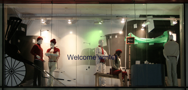
Window shopping has been a favorite pastime amongst people since the ages. What you display on your window makes a huge difference to the footfalls as well as sales. Because a window graphic is customer’s first interaction with your business, it needs to be eye-catching to capture the attention of the consumer. The whole idea of a window graphic for your storefront is to draw in customers and increase sales. Therefore, the window graphic for your storefront needs to be trendy, creative and effective to create an impact. Here are a few tips to create a window graphic for your storefront.
Have a Short and Clear Message
Deliberating over your type of business, your retail store, its location, and your customer base will help you devise a good window graphic message. The message conveyed via the window graphic should be consistent with what your brand stands for. If you are known for something, let that be conveyed in your message. It is important to not steer too far from the essence of your brand, as that may confuse and turn off the customer. Advertise the message or product that a customer will find when they walk into your store.
Create an Impulse
The window graphic of your store is the first thing that a passerby will look at. Hence, it must be created in a manner which creates an urge in the customer to enter and buy your products. Whatever route your take, be it a good offer display, or a creative visual, it must create a strong feeling in the mind of the passerby to want to enter the store, look around and buy something. Appeal to the sense of impulse by an eye-catching window graphic and then use indoor graphics, merchandise and customer service to increase sales.
Focus on the Merchandise
The aim of your window graphic is to increase sales by selling your merchandise. Therefore, it is essential that your merchandise be the main focus of the window graphic. It is a bad idea to confuse the customer by displaying a graphic that makes them forget the actual product being advertised. You want to showcase your merchandise in way that it entices them to come inside your store for more.
Choice of Word Size and Colors
The letter font and the colors used are very crucial to the success and failure of your window graphic. Use a font size that is clearly legible to people walking by your store. Visuals can stimulate the customer to enter your store, hence using the right color scheme is essential. For example, colors such as red, orange or black attract impulse shoppers, while colors like pink and rose can draw traditional buyers. Choose trendy hues to create an attractive contrast on your window graphic. It is advisable to consult an advertising professional in order to get the right mix.
Less is More
Do not overdo your window graphic. Having too much will clutter the window, hide the message you wish to convey and turn off the customer. The goal is to make a compelling window graphic that is creative and trendy, not jumbled and confusing.
The right use of the above-mentioned tips can help you design an enticing window graphic for your storefront. Consult an advertising professional to help you design an effective window graphic to gain maximum returns out of it.
Image Source: commons.wikimedia.org


Pingback: Get Best Window Graphic To Increase Footfalls |...