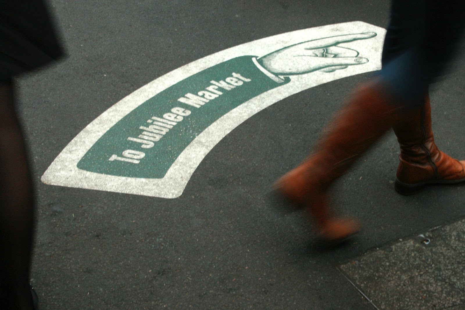
Floor graphics are a creative way to impress your customers. Floor graphics are mainly used in visual merchandising, and event production. They can be used as a substitute to overhanging signboards. Placement of floor graphics should be decided beforehand and then made accordingly. However, there are commonly made floor graphics mistakes which you should avoid. Some of them are as follows.
1. Using Poor Quality Adhesive
A poor quality adhesive will eventually come off after some time. When you are extracting or removing the graphic, the adhesive will leave a noticeable traces. The floor becomes rough with time when adhesive remains on it. A good quality adhesive should not leave any trace behind once the graphic is removed. Also, make sure that before applying them, your surface is clean and dry.
2. Using Cheap Floor Graphics
Using cheap floor graphics can tear or peel off much earlier than you expect them to. The appearance of air bubbles could be another sign that your floor graphic is of cheap quality. The last thing you want is the color to fade. This will happen if you buy cheap floor graphics. Use well-priced floor graphics which are of good quality and lasts long.
3. Not Using Lamination
Laminating your floor graphics is of utmost importance. By not doing so you may face problems such as wearing out of floor graphics before you actually expected them to. Not laminating will also make your floor graphics dirty or they may tear. Overall your graphics will last longer if you laminate them.
4. Having an Uncleaned Floor
The area where the floor graphics is going to be placed should be clean and dust free. If not cleaned, it may lead to an uneven surface after installing the floor graphics. An uncleaned floor will also lead to air bubbles. It will be a major issue later on if you have to reapply the floor graphics. Make sure you mark the area where you are going to install the floor graphics so that you can get your advertising spot on!
5. Picking the Wrong Color
It is important for you to use the right color codes. For example, a color such as red can be used for restricted area and so on. Color codes can also be used in parking spaces for cars and motorcycles. Ensure you choose the color for the graphic which looks attractive and does not blend in with the floor. For example, if you have a white floor, make sure you use a contrasting color which does not blend with it.
Floor graphics are extremely important and can be beneficial for your business. Floor graphics should be strategically planned and placed in such a way that they catch the attention of your customers. If you seem to have confusion regarding floor graphic designs, it is recommended to consult a professional.


