Even though online advertising is all the rage, billboard advertisements have not died out. If you walk across a busy street or a highway, you will see lots of billboards hanging all around. The challenge here for marketers is to make the target audience to notice their billboard message and act accordingly. Gaining the attention of the target audience requires good billboard design. So how do you craft such a billboard to grab more eyeballs? Here are a few billboard design tips to help you out.
Limited Words
One of the most common billboard design tips is to have limited words in your billboard. Your headline should not comprise of more than 5-7 words. Make sure that the headline is clearly understood when read in the first instance itself. Do not complicate or confuse your target audience by coming up with jargons on your billboard. At the same time, the words should be in big font size that can be read easily from afar.
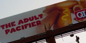
Source: https://www.flickr.com/photos/alansparky_atlanta/
Images
Pictures are more effective than texts. If you are unable to communicate the desired message with limited words, then use pictures or images for your billboard design. Use one large picture to gain the attention of the reader. Additionally, take a picture of a small object and make it large (like a food dish) instead of making a large object look small (like a restaurant). Care should be taken that the picture or the image that is used should be of high quality in terms of the resolutions and the colors used.
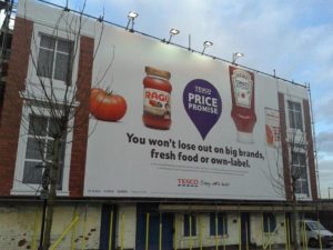
Source: https://www.flickr.com/photos/ell-r-brown/8552521600
Simple
A billboard design should be simple. The background and the elements (texts, images) of your billboard should match with each other. Use a simple font style for your texts. Moreover, avoid complex visual metaphors or difficult references. An advertisements should be understood within seconds. This is even more relevant when your billboard is placed along the highways where people have a minimal time to read and understand your message.

Source: https://commons.wikimedia.org
Color Contrast
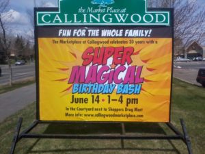
Want to grab more eyeballs? Have an excellent color contrast among all the elements in your billboard. Use of bright colors is effective to get the attention of your target audience. At times, the billboard looks vivid during the day but becomes dull during the night. In order to avoid such a situation, use colors that make the billboard clearly visible in the bright daylight as well as in the night.
Following these billboard design tips will help your billboard grab more eyeballs. Furthermore, having billboards at multiple locations gets you more people to see your billboard. Simultaneously, find the best billboard location. If you need help in coming up with creative billboards or more information with respect to designing a billboard, then get in touch with an experienced billboard designer in Alberta.
Source: https://www.flickr.com/photos/jack_man/




Pingback: How To Create An Eye-catching Billboard In Edmo...