
Outdoor advertising through signage is a traditional method of advertising or publicizing any information. There are various forms of signage available to do so. Banner is one such signage widely used by businesses to advertise their brand. While it’s a good technique, many people lack in conveying the message due to mistakes in execution. Here are some mistakes to avoid, listed by a Calgary Bridge banners specialist.
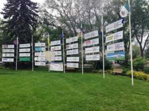
Not Designing As Per Location
When designing a banner for advertising your business or event, the very first thing to consider is the location where you will be placing the banner. If you are placing the banner near a busy road with more vehicular traffic than pedestrians, then you need to keep your banner simple for a quick and easy read. Similarly, the font should be easy to read. Another aspect to consider is the direction of the sunlight. If it forms a glare on your banner, it will not be visible to the reader. Choose a banner which is clear and visible during different hours of the day.
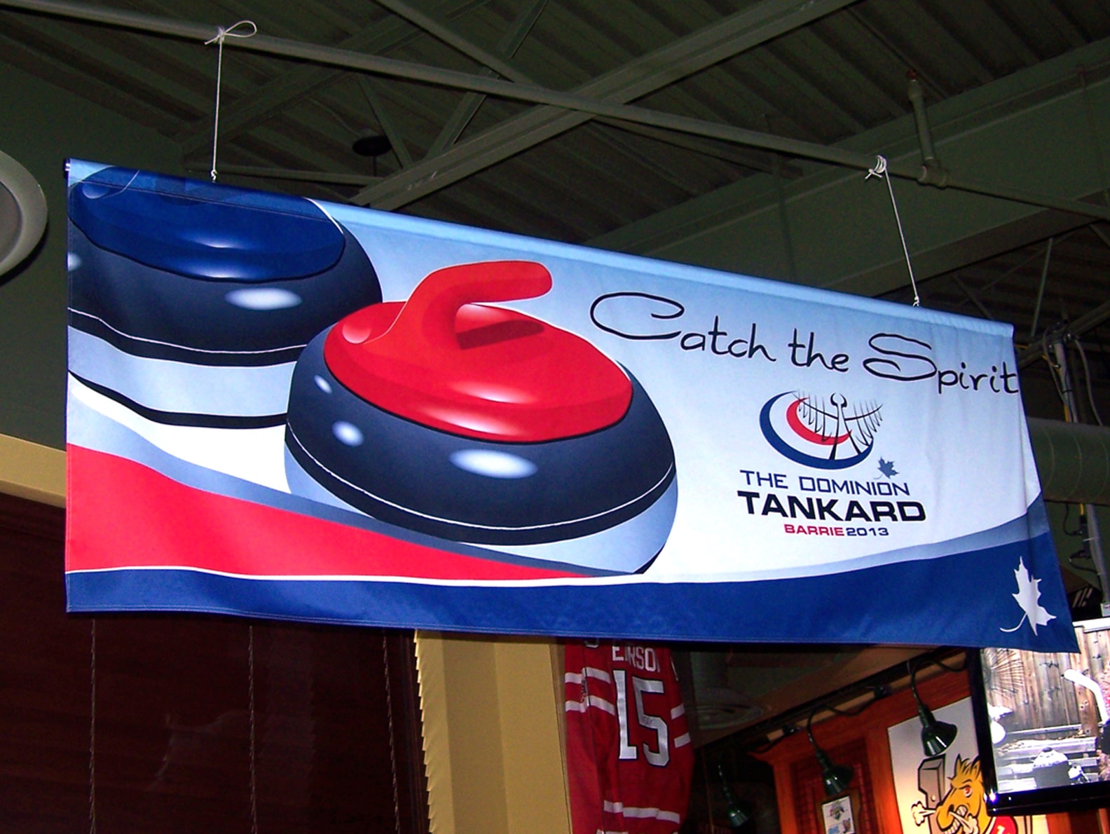
Wrong Use of Images
When designing a banner for your business, refrain from putting many images, at the same time, do not leave your banner without an image. Your banner needs to have a good image to grab the attention of the reader. You could also put more than one image, but ensure that you do not clutter your banner with too many images. Too many images confuse the reader and make your banner look cluttered.
Putting Too Much Information
Remember your banner is a signage whose sole aim is to publicize your business or event. After adding a good image and bright colors, it is essential to provide the information briefly and crisply. Have a headline about your event or business and then just a one-liner to follow it up. You do not want to create a banner that has a summary paragraph of the event – no one has the time to read so much.
Not Doing a Grammar Check
The banner sign should advertise your brand, but not for the wrong reason. Not doing a thorough grammar check before you finalize a banner will grab people’s attention but for the wrong reason. Apart from being laughed at for the error, the reader might not have trust in the business’s professionalism.
Not Providing Contact Details
This is a major banner mistake which will affect your business adversely. You might have an impressive signage with bright colors and catchy images, but what will a person do about it if there is no contact detail? The main aim to advertise is to make people reach out to you. Not mentioning the contact details will just make the reader read your content and walk away. The contact details are your call to action to the reader.
Just making use of signage to advertise is not enough, you need to design a good signage without falling prey to these common mistakes. Keep the points mentioned above in mind when designing your banner. At Alberta Signs, we provide Calgary Bridge banners and outdoor signage solutions, so get in touch to design a signage for your business.