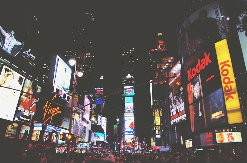
Billboards have been the medium of communication and advertising for many years. They can be used for multiple purposes such as creating brand awareness, running election campaigns, and even promoting a newly opened shop. As an advertiser, when you promote your products or services, you should know what content you would like to put forth for your potential customers and therefore, create an effective billboard design. This article gives you a few tips on how to design an effective and eye-catching billboard advertisement.
Get Your Story Straight
Your billboard ad is not the only one that customers are looking at. Your billboard is competing for your customer’s attention! When you design a billboard, consider how your audience would see it. Would the billboard capture their attention or would they just skim over it? Your billboard should be interesting to catch the attention of passersby and get them to read your message. So, in order to convey your message, make a story by adding pictures and having compelling words in your ad. Also, provide your product’s or service’s specifications and features in the ad copy. Avoid any irrelevant information or complex words which the readers may find it difficult to understand. Hence, get your story straight as it will help your customers to relate your product and understand the message easily. In short, convey your message effectively to your customers.
Keep it Short, Sweet, and Safe!
You need to design your billboard in such a way that your customer gets maximum knowledge at a single glance. Make sure you do not provide too much information on your billboard. The attention span of people is short and therefore, you need to quickly communicate the message before they are distracted. For this purpose, you can make use of images to communicate the message in short.
For example, you have a helmet company and want to advertise your brand new helmet series. You can add pictures of the helmet specifications and add a quote saying “This helmet can be as comfortable as your pillow”.
Be Loud
You have a lot of space on a billboard to work with. Hence, use the space to its full capacity and make sure you have large text and proper font colors that are contrast to each other ensuring the best readability. This will create better visibility from a distance. Additionally, the customer will take more time in reading the billboard as it will be visible even from a distance.
Be Colorful
Use bold designs or colors which will attract eyeballs to your billboard ads. Remember to have a proper contrast. For example, have a darker background color and an image in a lighter shade so as to create a contrasting effect. Keep your background simple and in one color such that your foreground does not fight for attention. Use of backlit displays can also be brought into play. Backlit displays help light up your billboard which increases their visibility at night.
Avoid Repetition
Billboard advertising costs a lot of money hence, you need to use all of the space on it wisely. It is of no use if your text explains the image which is present on the billboard. Having dull imagery or if the image does not relate to the product mentioned on billboard, then you have to reconsider the billboard design. Hence, always remember to use your billboard space wisely and avoid any kind of repetition.
Call to Action
The purpose of a billboard should be to convince the reader to take a particular action. For example, a pizza advertisement can have their phone number on their billboard and a call to action saying, “Buy 1 Pizza and Get 1 Pizza free!” Entice your reader to take a particular action.
These are a few tips for an effective billboard design. Billboard designs can make or break a product or service that you are advertising. Therefore, follow these above-mentioned tips and run an effective billboard advertising campaign for your business. If you are looking for more insight on a billboard design which will help you get more customers, you should consider designing the billboard from an expert.


