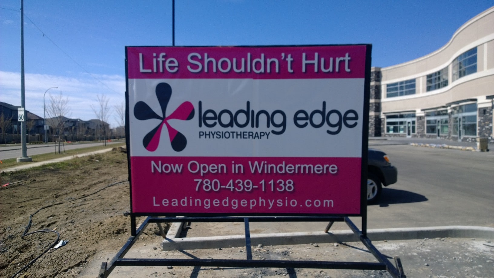
Customers, or lack thereof, can make or break a business. Stiff competition has encouraged businesses to rethink their market strategy. Sophistication in consumer trends has forced advertising mediums to become more innovative. Such innovation is apparent in the creation of standee banners. Businesses, today, cannot afford to neglect the design elements that go into making these banners.
To get more business, you need to understand what goes into designing a good standee banner. Here’s how attention grabbing banners are crafted.
Cutting costs on graphic output
Avoid online banner printing that uses inkjet machines. Graphic panels should be printed photographically as this eliminates banding and tonal ranges. These images are high in quality and have sharper text.
Durability
One of the advantages of a standee banner is its reusability. This is achieved by covering the banner with scratch resistant, UV protection laminate.
Design elements
The design elements of a standee banner represent its aesthetic value. Decide carefully as this is what your customers will see.
1. The hook
Keep the most important content at the top end of the banner. This usually involves the company logo and a catch phrase to grab the viewer’s attention. The height of this message will be around the eye level of the viewer. Hence, this will be the first thing your customer will read.
2. The reel
The middle section of the banner should contain information about the services you provide or the product you offer. Usually, this section talks about the product or the business. An image can be added here for emphasis.
3. The bait
The colors in the banner should be complementary to its visual presentation. This means that they should be pleasing to the viewer and easy to look at. Throw in too many colors and the message in lost.
All graphic visuals on the banner should be crisp and high quality. Poor quality and low resolution images give a bad impression. Most viewers make up their minds on the company just by looking at the image quality.
4. The pull
Contact information is the most unimportant element in banner design. This information should be placed in the bottom half of the banner. Business cards serve as a better medium for containing contact details.
Additional tips
- When you design your banner, opt for a message that is timeless. This will ensure that you do not need to reprint your banner again and again for minor changes.
- Utility is important when it comes to standee banners. They should be reusable for various occasions.
-
Don’t cram your banner with too much information. Keep the viewers attention span in mind. Less is more and this is equally true for designing standee banners.
This simplicity and ingenuity of design make standee banners, the perfect advertising medium for niche businesses and trade shows. Online banner printing, portable signs and other products are all commercially produced by Alberta sign rentals. Our standee banner price is really affordable for the quality we provide.


