
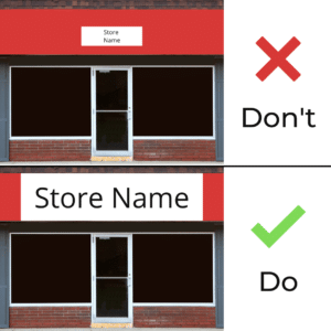
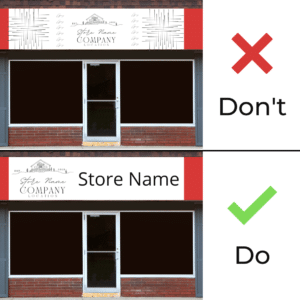
Sizing: too small
The most common and biggest mistake companies make is with the size of the sign. Often it is far too small to be read from across the street or across the store. Your storefront and indoor signage needs to be visible from various distances.
Having your font span edge to edge can hinder the impact and effectiveness of your message and your sign. Letter visibility is increased with balanced whitespace around each word. Our vast choice of sign sizes and materials can ensure your choice of signage will be the right size.
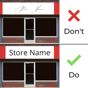
Font choices: too much means too cluttered
Sans serif, serif, classical, script and whimsical. The choice of fonts is endless, but impactful sans serif fonts will increase the readability of your signage.
A good rule of thumb is to plan out your content well ahead of time. Our in-house graphic department can assist to help you plan your message in the most clear and concise manner and it is included in all of our pricing.
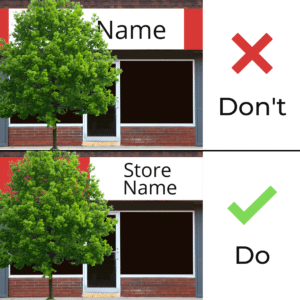
Placement: can it be easily seen?
The placement of signs on the outside of the building seems like a simple task: the sign goes above the door and that’s all you need, right? But what if there is a big tree blocking it? What does the front look like during all seasons?
For the most part, you might be able to guess what the front of the store looks like from season to season, however, keep that in mind. Trees bud and flower grow taller. Outdoor and storefront signage is your first impression to customers, and it should be memorable.
Indoor signage is no different. Placing signs in easily visible locations without interference to be able display messaging is a must. Decals are a great option to add as a focal point to the interior decoration as well as provide messaging.
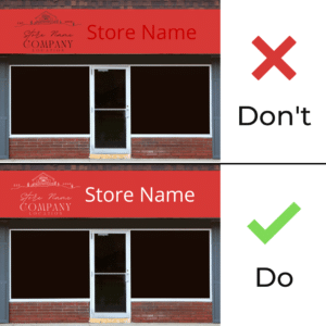
Information: too much or too little
Clear, concise and memorable: that is the key with all messaging from your website to your social media. Your storefront and indoor signage is no different. If your signage contains too much information, your messaging will be hard to read from a distance or as people are driving by.
There are a few simple tricks to keep in mind when planning information you want to promote on your signage:
- Logo/art should be simple and clear without moving into logo fail territory
- Verbiage should be clear and concise without hidden meanings
- Colour palette can be useful to create memorable eye-catching designs. It can also create a way to add more or different information to signage
- Keep it simple – short and sweet messaging is best. That means no long paragraphs.
Colour: choice and contrast
Complementary or contrasting? Does it really matter?
Contrast can take a sign from drab and flat to striking and remarkable – your choices can impact your brand significantly! Staying consistent within your branding will keep your company memorable to your customers. At a quick glance, your brand will stay in your customers’ minds and the recall will be quick when they head over to your company.
Contrasting colours and colour choice can make your messaging stand out!
There are so many things to think about with signage, and so many tips and tricks our team knows. Our clients trust our expertise to ensure they get the most value from their signs.
Contact us today to meet with our team to create your on-brand, memorable signage to launch your brand and company higher.

