Remember those days in elementary school when we had museum visits? The experience used to be informative, and at the same time, a little dull as the historic content may not be something we would be interested in back then. Visiting a museum as an adult can seem interesting but still a little dull. So what is it that can make your museum interesting for all? The answer is floor and wall graphic signs in Calgary Alberta. To help you make your museum interesting, here are some ways to make use of floor and wall graphics.
Innovation To Information
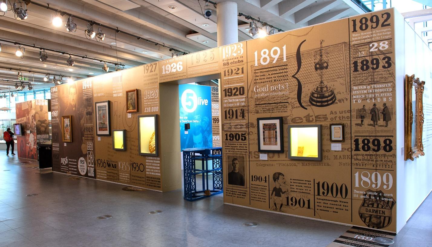
When you are exploring a museum, do you walk towards a good exhibit but skip reading about it because of the tiny dull script? It is natural to feel disinterested in reading the fine print. This can be avoided if you have an exhibit which has amazing wall graphics, written in large fonts to grab the attention of the readers. To enhance the experience for your visitors, you could create infographics of the exhibit and put it on the wall or floor of your exhibit.
Form Of Direction
Museums are generally large buildings with multiple floors and rooms to explore. A common problem is losing track of the exhibit which has already been viewed thereby making you visit the same exhibit again and again. Another issue faced by many visitors is the chance of missing out an interesting exhibit because they couldn’t find it. For this reason, you need to have appropriate directives to guide your visitors to each exhibit. To add those directives, you can use floor graphics to provide a step by step direction. Floor graphics will also make it a fun way of finding exhibits for your visitors.
Mural Incorporation
What better way to depict the development from ‘Stone Age’ to ‘current age’ than a mural? A museum being a large space has multiple walls. Simply select a wall and put up murals with the theme of your museum to give the visitor a short pictorial idea of what lies ahead instead of a usual boring exhibit map.
Section Division

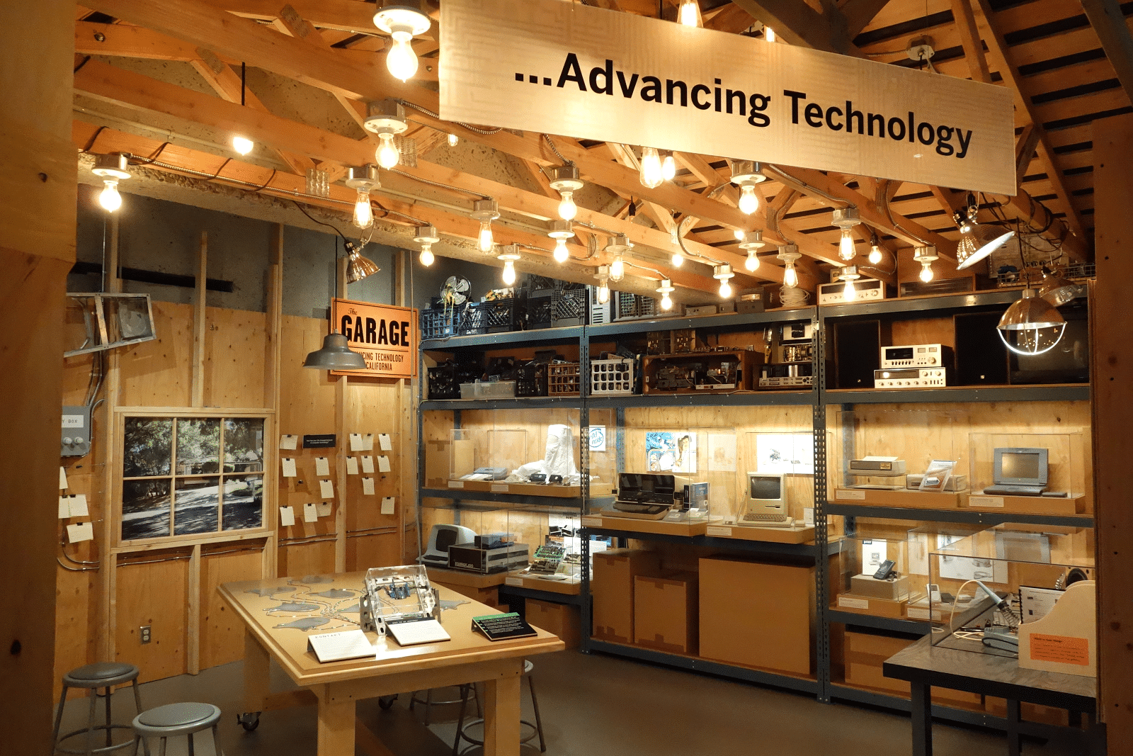
With so many displays put up under one roof, it becomes essential for you to divide them based on themes and subjects for easy viewing of your visitors. Why use the same old method of naming each section with a section header when you can graphically illustrate what the section has in it. Incorporate both floor and wall graphics to personalize each section with images and stylish font to describe each section.
Graphics can indeed make anything interesting to look at and increase the readability of the content. When you already have a museum with interesting exhibits and displays, why not enhance it with the use of floor and wall graphics? Do not think twice and get graphic signs in Calgary Alberta today from the finest floor and wall graphic designers.


