Spring is here, and you can’t help but look forward to what these warmer days have to offer. Because it comes with relatively dry days, spring provides itself as the perfect time to re-think that signage design and perhaps put up a new one too. An eye-catching signage design can dramatically increase the chances of your business to gain more consumers who are willing to put in money into the products or services that you offer. But before they do, you have to carefully think about the design for your storefront sign in Calgary.
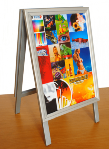
Whether it is a frame sign in Calgary or a window decal on your storefront, it is essential that you rethink all the details that you include in your signage. Here are the factors that you need to consider:
The Font
Fonts can make or break a signage design. Telling your target consumers of the products and services that you offer as well as the other details of your business rely on the font that you are using. This spring, it is time to rethink the font you are currently using. Are they clean and clear? Are they readable even from a distance? Go for easy-to-read lettering for your outdoor signage. After all, the goal is to encourage clients to come in. If they can’t read the outdoor signage, there is nothing else that could make them come in your store.
The Colors
Wondering what colors would be right to use? The call for businesses to be eco-friendly will make them want to go for more earth tones in their signages. Pastel colors will be a big hit too considering how pleasing to the eye they are. If your business aims at targeting local consumers, it is best to go for earthly tones like a lighter shade of green, blue and yellow. Not only will these colors make you distinct, but they could appeal to your target consumers in a way you want them to.
Clarity
Many of the signages that you see around you are decorative. Very few of them, though, can achieve the kind of clarity that consumers are looking for. This spring, the trend is to go less decorative and be simpler yet direct to the point. Such types of signages are easy to read and pleasing to the eye. Be clear and concise in the message that you want to deliver and the best way to do it is to have a meaningful yet straightforward outdoor signage for your business. You’d be surprised at how well they could attract customers with their simple yet modern design.
Thinking about how you can apply these trends to your business signage? It shouldn’t be that hard. All it needs to be is simple, direct to the point and honest.


