

Whether you’re promoting a grand opening, directing traffic to your construction site, or advertising your latest sale, the difference between a sign that gets noticed and one that gets ignored often comes down to smart sign design choices. After years of helping Alberta businesses make their mark with effective signage, we’ve learned that great sign design isn’t about luck—it’s about understanding a few key principles that make your message impossible to miss.
The Science of First Impressions
Your sign has just seconds to capture attention and communicate your message. In our fast-paced world, people make split-second decisions about what deserves their attention. A well-designed sign doesn’t just compete for eyeballs—it wins them through strategic use of design elements that work with human psychology, not against it.
Colour: Your Most Powerful Tool
Colour isn’t just decoration; it’s communication. The right colour combination can make your sign visible from twice the distance while the wrong one can render even the largest sign practically invisible.
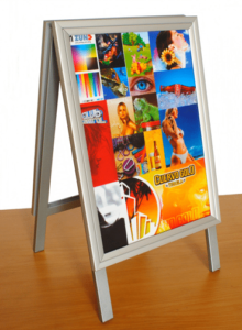
High Contrast is King: The most readable signs use colours that create strong contrast. Classic combinations like white text on dark backgrounds or dark text on light backgrounds work because they’re easy for the eye to process quickly. Yellow and black offer exceptional visibility, which is why you see this combination on warning signs and taxi cabs.
Consider Your Environment: A red sign might pop against a blue sky, but it could disappear against a brick building. Think about where your sign will be displayed and choose colours that will stand out in that specific context. For outdoor signage in Alberta, consider how your colours will look against snow in winter and green foliage in summer.
Emotional Impact: Different colours trigger different emotional responses. Blue conveys trust and professionalism, red creates urgency and excitement, green suggests growth and health, while orange demands attention and implies action. Choose colours that align with your message and brand personality.
Typography: Making Words Work Harder
The font you choose can make or break your sign’s effectiveness. Typography isn’t just about looking nice—it’s about being read quickly and clearly from a distance.
Simple is Superior: Avoid decorative or script fonts for main messaging. Sans-serif fonts like Arial, Helvetica, or custom condensed fonts typically offer the best readability. Save decorative fonts for small accent text only, and even then, use them sparingly.
Size Matters More Than You Think: As a general rule, each inch of letter height provides roughly 10 feet of readable distance. If you need your sign to be read from 100 feet away, your letters should be at least 10 inches tall. Don’t try to cram too much text into a small space—it’s better to have fewer words that can actually be read.
Weight and Spacing: Bold fonts are more visible from a distance than thin ones. Ensure adequate spacing between letters and words. Cramped text is difficult to read, especially when viewed quickly or from an angle.
Layout: The Art of Visual Hierarchy
Good layout guides the viewer’s eye exactly where you want it to go. Poor layout creates confusion and reduces the impact of your message.
Follow the Z-Pattern: Western readers naturally scan in a Z-pattern—top left to top right, then diagonally down to bottom left and across to bottom right. Place your most important information along this visual path.
Embrace White Space: Don’t feel compelled to fill every inch of your sign. White space (or negative space) gives your message room to breathe and makes it easier to process. A cluttered sign is a confusing sign.
Create Clear Hierarchy: Use different font sizes, weights, and colors to establish what’s most important. Typically, this means your business name or main offer should be largest, followed by supporting details, with contact information or calls to action being smaller but still clearly readable.
Balance Your Elements: Distribute visual weight evenly across your sign. If all your text is crammed into one corner, the sign will feel unbalanced and may be less effective at catching attention.
Practical Considerations for Alberta Businesses
Weather Resistance: Alberta weather can be tough on signage. Choose colors that won’t fade quickly in intense summer sun or become difficult to read during winter’s shorter days. Light-colored backgrounds can help with visibility during our darker months.
Distance and Speed: Consider how fast people will be moving when they see your sign. Highway signs need to be read at 90 km/h, while pedestrian signs can include more detail. Adjust your design complexity accordingly.
Common Sign Design Mistakes to Avoid
Too Much Information: Your sign isn’t your website. Stick to the essential message—who you are, what you offer, and how to find you. Leave detailed information for other marketing materials.
Poor Color Combinations: Red text on green backgrounds, blue on purple, or any combination that creates visual vibration will strain viewers’ eyes and reduce readability.
Inconsistent Branding: Your sign should reinforce your brand identity, not conflict with it. Use colors, fonts, and styling that align with your other marketing materials.
Ignoring Viewing Conditions: A sign that looks perfect in bright office lighting might be invisible at dusk or unreadable in direct sunlight. Consider all the conditions under which your sign will be viewed.
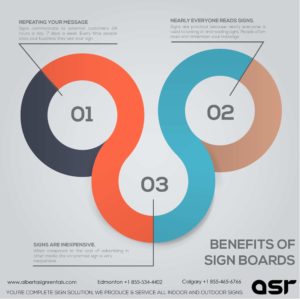
Making Your Sign Design Investment Count
Effective signage is an investment in your business’s visibility and success. A well-designed sign continues working for you 24/7, communicating your message even when you’re not there. By applying these design principles—strong color contrast, readable typography, clear layout hierarchy, and practical considerations for your specific environment—you’ll create signage that doesn’t just fill space, but drives results.
Remember, the goal isn’t to create the most artistic sign possible, but to create the most effective one. Great sign design balances creativity with clarity, ensuring your message reaches your audience quickly, clearly, and memorably.
Ready to put these principles to work for your business? Professional sign design takes the guesswork out of these decisions, ensuring your signage investment delivers maximum impact for your Alberta business.
Contact us today to learn more!
