

Effective business signage remains one of the most powerful yet underutilized tools in business marketing. This comprehensive guide explores the strategic principles, design fundamentals, and practical applications that make signage work harder for your business. Additional detail on each of these topics can be found in our 2025 website blog posts.
Building Brand Identity Through Signage
Your signage serves as a 24/7 brand ambassador, communicating values and personality to everyone who passes by. Every design choice matters: sleek modern aesthetics signal innovation, while warm rustic materials convey authenticity and tradition. Bold colors communicate energy, and sophisticated finishes suggest luxury.
For businesses across diverse markets, alignment between brand values and visual presence creates instinctive trust. Whether you’re eco-conscious (using sustainable materials and natural colors) or positioning as a luxury brand (choosing premium finishes and sophisticated typography), your signage becomes the living representation of your mission without requiring explicit corporate messaging.
The flexibility of rental signage offers strategic advantages for evolving brand identities. Businesses can test new designs, adapt to seasonal campaigns, or update messaging as they grow without the commitment and expense of permanent installations. This adaptability proves especially valuable for location-specific branding needs and temporary applications like construction sites, events, and real estate listings.
The Science of Colour Psychology
Colour communicates before words do. Within milliseconds, viewers process colour information and form impressions about your business. Understanding these psychological triggers allows strategic colour selection that aligns with brand identity and target audience.
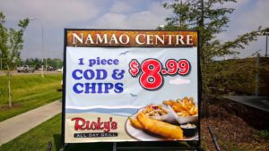
Red creates urgency and excitement, making it dominant in fast-food chains and clearance sales. Blue conveys trust and professionalism, favored by banks, healthcare facilities, and technology companies. Green suggests growth, health, and eco-friendliness, while yellow radiates optimism and grabs attention from considerable distances.
Beyond psychology, technical considerations ensure visibility. High-contrast combinations like black text on yellow backgrounds or white lettering on dark blue maximize readability from both near and far distances. The 70/30 rule creates visual hierarchy: use your primary brand colour for 70% of the sign, secondary colour for 20%, and bold accent colour for the remaining 10%.
Industry-specific strategies reflect evolved conventions. Restaurants use warm colours (red, orange, yellow) known to stimulate appetite and create urgency. Medical facilities stick to cool blues and greens that lower blood pressure and create feelings of calm and trust. Luxury brands employ black, gold, or deep jewel tones to convey exclusivity, while discount retailers use bright, high-energy colours to communicate value.
Environmental considerations matter significantly. Signs against busy, colourful backgrounds need bold contrasting colours, while those in minimalist settings can use subtle palettes. Time of day affects visibility, making illumination and reflective elements crucial. Seasonal adjustments maintain maximum impact as signs that look vibrant against summer greenery might disappear against autumn foliage.
Design Principles That Drive Results
Great sign design balances creativity with clarity, ensuring messages reach audiences quickly, clearly, and memorably.
Typography Fundamentals: Simple sans-serif fonts like Arial or Helvetica offer best readability. Each inch of letter height provides roughly 10 feet of readable distance—signs read from 100 feet away need letters at least 10 inches tall. Bold fonts prove more visible from distances than thin ones, and adequate spacing between letters and words prevents cramped, difficult-to-read text.
Layout Strategy: Western readers naturally scan in a Z-pattern (top left to top right, diagonally down to bottom left and across to bottom right). Place important information along this visual path. Embrace white space to give messages room to breathe. Create clear hierarchy using different font sizes, weights, and colours to establish what’s most important. Distribute visual weight evenly to avoid unbalanced, less effective designs.
Common Mistakes to Avoid:
- Too much information that overwhelms viewers
- Poor colour combinations that strain eyes and reduce readability
- Inconsistent branding that conflicts with other marketing materials
- Ignoring viewing conditions like lighting, distance, and speed of passing viewers
- Overcomplicating designs with excessive detail that dilutes messages
- Choosing decorative fonts that hinder quick comprehension
- Neglecting proper placement and visibility considerations
- Failing to consider target audience preferences and cultural considerations
Strategic Applications: From Storefronts to Events
Storefront Excellence: Clarity and legibility remain paramount. Business names and core messages should be instantly readable from a distance using clean, easily deciphered fonts. High contrast between text and background colours makes signs pop. Strategic placement considers sightlines from foot traffic and vehicles, while proper lighting ensures visibility during darker hours.
Banner Stands for Maximum Impact: These portable, professional solutions excel at conferences, trade shows, in-store promotions, and temporary displays. They transport easily to different events without logistical challenges of permanent displays. Effective banner design uses high-contrast colours, clear typography, and concise messaging that communicates within seconds. Indoor conference settings allow more detailed information, while outdoor or high-traffic areas require bolder, simpler designs.
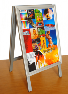
A-Frame Versatility Beyond Sidewalks: Beyond traditional sidewalk placement, A-frames create in-store navigation systems, outdoor event branding, temporary directional signage for special events, and cross-promotional partnerships with neighbouring businesses. Their sturdy construction withstands unpredictable weather, and mobility allows easy repositioning as needs change.
Portable Signs as Marketing Tools: These dynamic tools capture immediate attention with strategic placement, provide flexibility for different locations and events, offer cost-effective advertising compared to traditional media, and allow quick message updates. Successful deployment requires positioning in high-traffic areas, frequently changing messages to maintain interest, aligning messaging with current business goals, and using eye-catching designs with clear, concise text.
Seasonal Strategy for Year-Round Relevance
Seasonal signage creates relevant connections with audiences by tapping into emotions and experiences tied to specific times of year. This adaptability enhances brand visibility and encourages customers to engage with fresh content that resonates personally.
Leveraging seasonal trends invigorates product offerings through limited-time promotions or exclusive collections. Seasonal colour schemes (vibrant oranges and deep browns for autumn, soft pastels for spring) capture attention and resonate emotionally. Incorporating themes beyond colours—snowflakes in winter, blooming flowers in spring—amplifies effects.
Creative typography transforms seasonal messages by selecting fonts reflecting each season’s essence and layering typography with textures mimicking seasonal elements. Incorporating local festivals into signage creates visual connections between brands and vibrant local traditions, fostering goodwill by demonstrating community support.
Holiday Season Success
The holiday season from late November through early January presents golden opportunities to capture attention and drive sales. Strategic temporary signage cuts through noise by creating urgency, highlighting special offers, and drawing customers to locations.
Effective Holiday Signage Options:
- A-frame sidewalk signs for high-traffic areas with daily deals and festive countdowns
- Window clings and decals transforming storefronts into eye-catching displays
- Feather flags and banner stands ensuring visibility even from distances
- Directional signs reducing frustration and improving customer experience
- Portable signs for budget-friendly campaigns across multiple locations
Best Practices for Holiday Impact:
- Deploy signage early (ideally November) to capture early shoppers
- Choose weather-resistant materials withstanding wind, snow, and freezing temperatures
- Keep messages clear and concise for shoppers moving quickly
- Use bold, readable fonts ensuring visibility in low winter light
- Incorporate holiday colours strategically while maintaining brand consistency
- Create urgency with phrases like “Limited Time” or “While Supplies Last”
- Include clear calls to action telling customers exactly what to do next
The Bottom Line
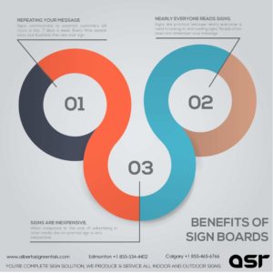
In a digital-dominated era, physical signage remains one of the most cost-effective and impactful tools for building brand identity and customer loyalty. Signs work around the clock and reach everyone who passes by. When designed thoughtfully to reflect brand values, mission, and personality, signage becomes an irreplaceable marketing asset.
The key questions every business should ask: Is your signage telling your story? Reflecting your values? Creating emotional connections that drive loyalty? For businesses looking to strengthen brand presence, the question isn’t whether signage matters, but whether current signage is doing everything possible to build your brand and drive results.
Contact us today to learn more!