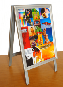
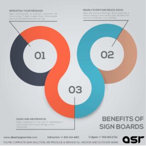
In this day and age when everything you need has become highly technological, advertising online has become one of the primary ways to market your business. Indeed, technology has changed the way people live their lives, but it has not changed the way people look at advertisements. Whether it is online or posted as a billboard across the main road, people’s attention is only caught by ads that tickle the imagination.
The value of each signage relies on several different factors. Each one is as important as the other elements in the poster, banner or billboard. Here are the top three design tips for your business. Keep them in mind, and you’ll be able to come up with signage that will work wonders for your business sales.
Tip 1: Color conveys identity.
Are your brand’s colors compelling? Do they make you distinct among competitors? More than 90% of a brand’s recognition is all due to the colors that the brand uses. And then there are the so-called trendy colors. Although it might be tempting to go for the more modern colors at this time, remember that longevity should always come first. When you go for the classic color combinations, not only are you choosing colors that will represent you today, but these are the colors that people will remember you for tomorrow.
Tip 2: Choose contrasting colors.
The color contrast of your signage is significant as it should determine the readability of the information that the signage contains. Since signage will usually include images and text, it is essential that you achieve the perfect balance between the two, not to mention contrasting colors that will make it easier for clients to read. For example, if you choose a darker shade for your background, it would be best to go for a lighter color for the text. The goal is to make it readable for it to be genuinely informative.
Tip 3: Size, in signages, do matter.
The size of the text makes a huge difference between what proper signage is from a bad one. The bigger the text, the more readable it is. Also, the bigger the text, the fewer words you can put on the signage. As a rule of thumb, the text should be at least 10 inches in height. When you got a billboard by the side of the road that has a text of at least that size, you can expect it to be readable to commuters even at a 100 feet distance.
When it comes to marketing your business, especially in a locality, sometimes, it is better to rely on good old-fashioned advertising. They can be your best bet. Attractive window displays, signages at the storefront and even billboards by the side of the road prove to be effective in promoting a business. Perhaps you should focus more on how you can get your signage to work its full potential. How do you turn client likes to real life revenues for the business?


